
#brainstorming
While drafting a design we took inspiration from the team’s magenta jerseys. This element has a strong visual value for the team – it highlights femininity and at the same time is a color that’s easily memorable and identifiable.
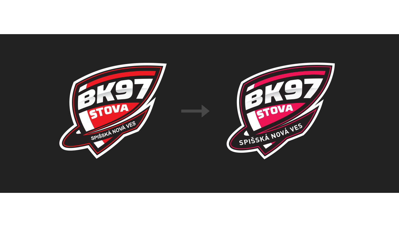
#logo
The logo has gone through several minor changes. Emphasis was placed mainly on details, visual unity and readability. All visual communication bears the spirit of monochrome and the team’s core magenta color – the logo is no exception.
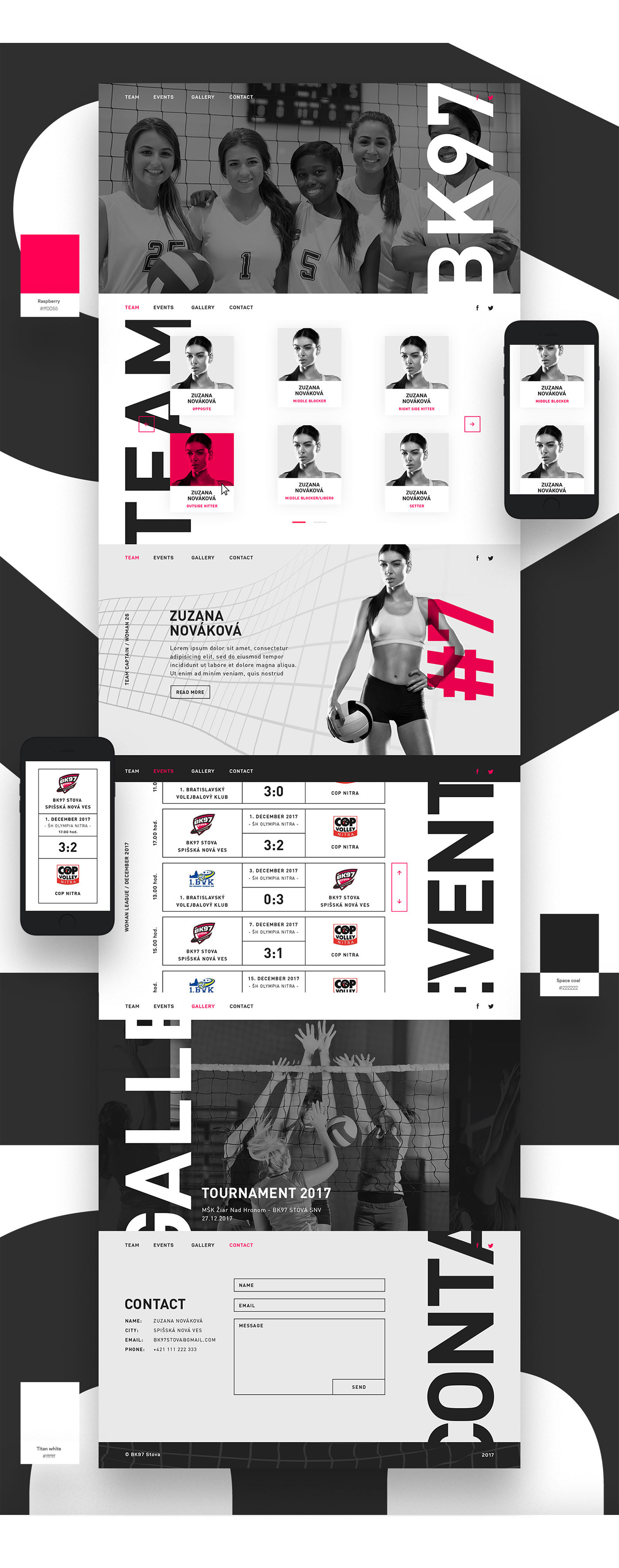
#web
On the scene is a unique color combination not commonly used, complemented by a vertical typography. Everything together gives a visually striking but still minimalist look.
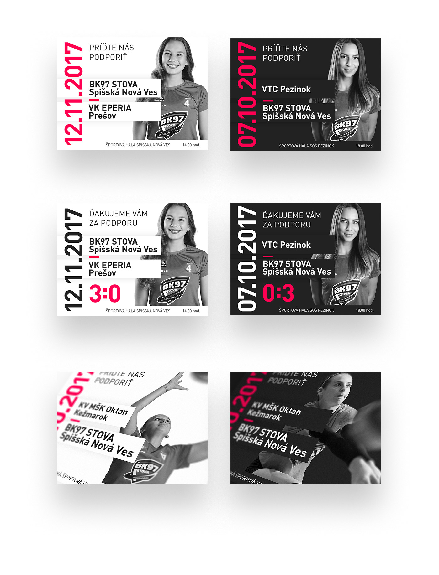
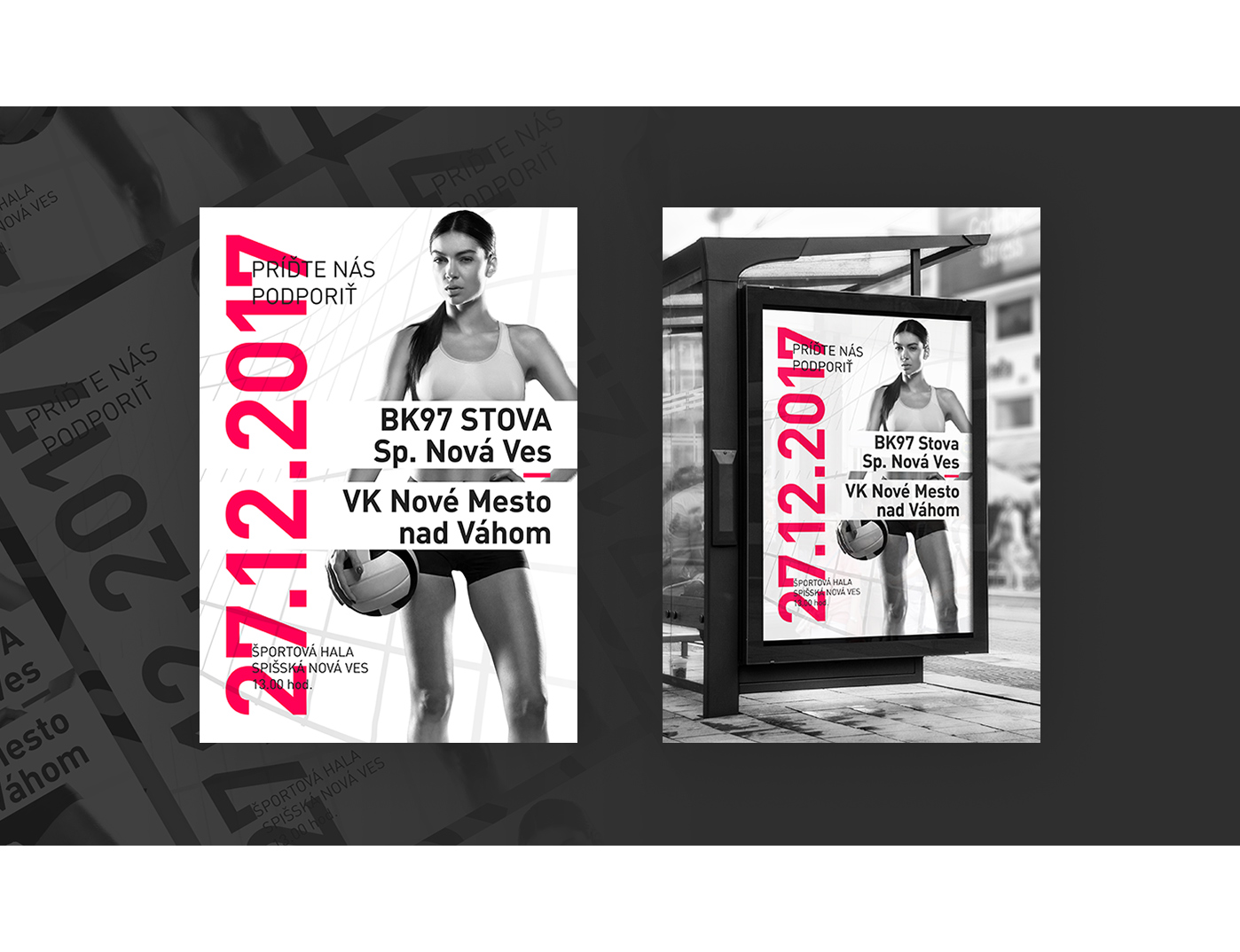
#social media
Different fan requires different post. We gladly, playfully and efficiently inform, invite and share sports events with you, all done in the spirit of our “visual identity”.